Overview
SMB // Brand, Identity, UX/UI, OOH
Brief
Orlando Corporation came to us as one of Canada’s largest commercial real estate developers, a brand with real institutional weight but a visual identity that had grown inconsistent across teams and touchpoints over time. The brief was a refresh rather than a reinvention: modernize the identity, sharpen it for clarity, and build a standardized system the organization could apply consistently at scale, without needing a creative director involved in every application.
Info
-
Client
Orlando Corporation
-
Industry
Commercial Real Estate
-
Scope
360° Marketing
-
Role
Creative Direction + Design
Brand

Identity
UX/UI
OOH
Summary
Refreshed for Scale
Orlando Corporation is one of Canada’s largest commercial real estate developers — a brand with real weight that had simply outgrown the consistency it needed to operate at that scale. The brief was a refresh, not a reinvention: modernize the identity, sharpen it for clarity, and build a standardized system the whole company could actually use.
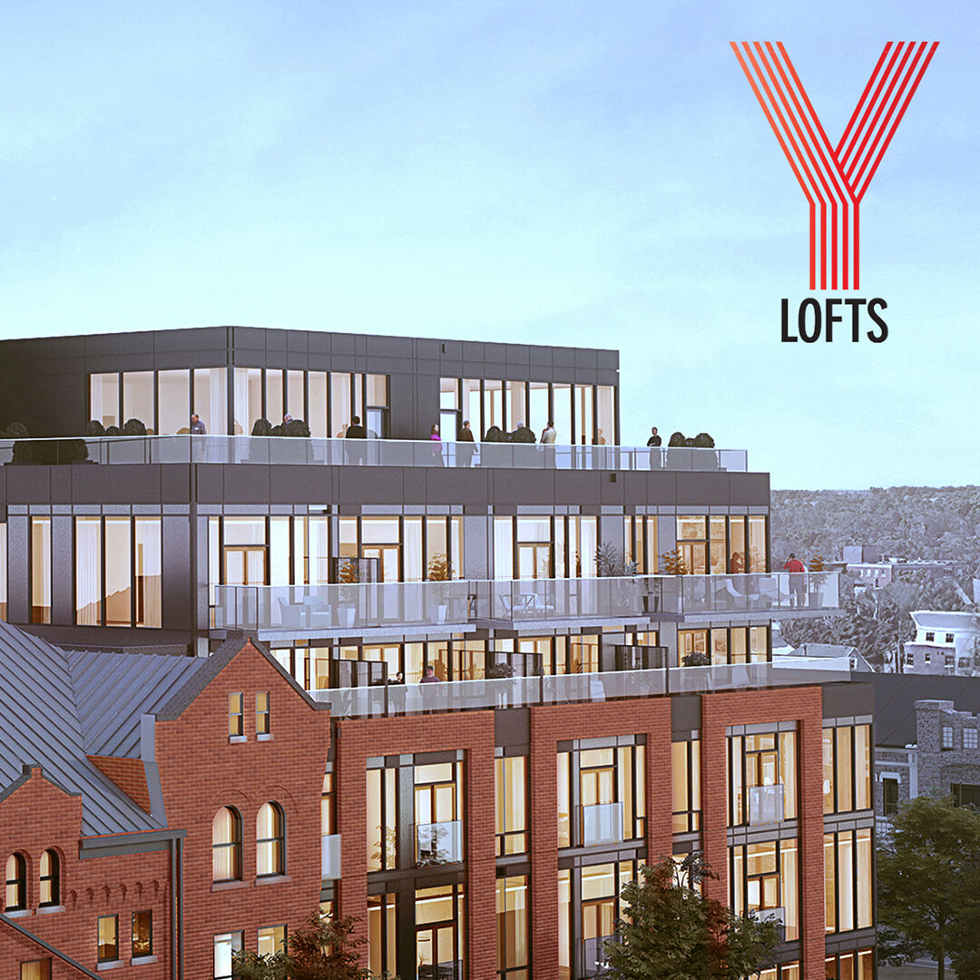
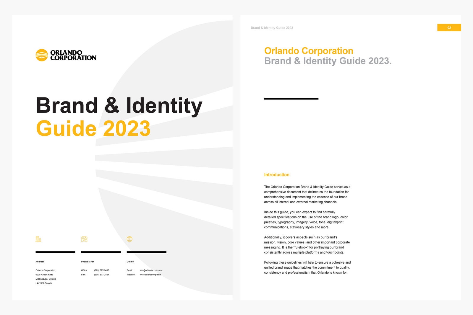
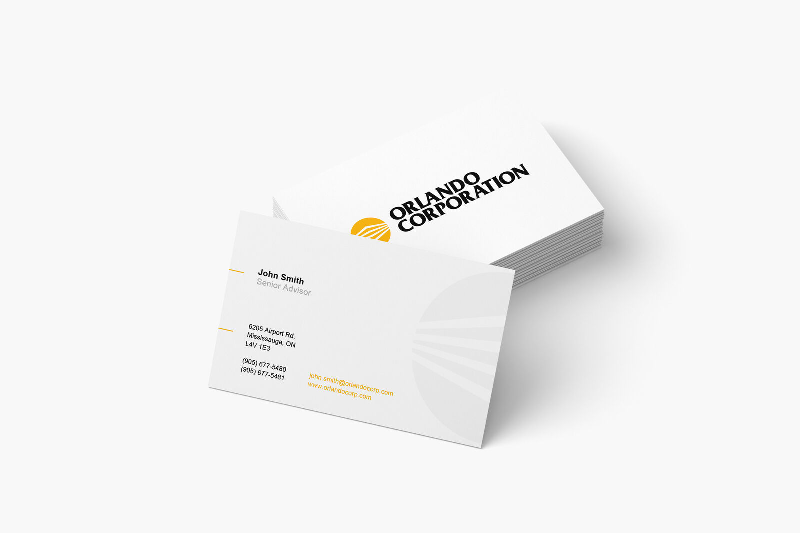
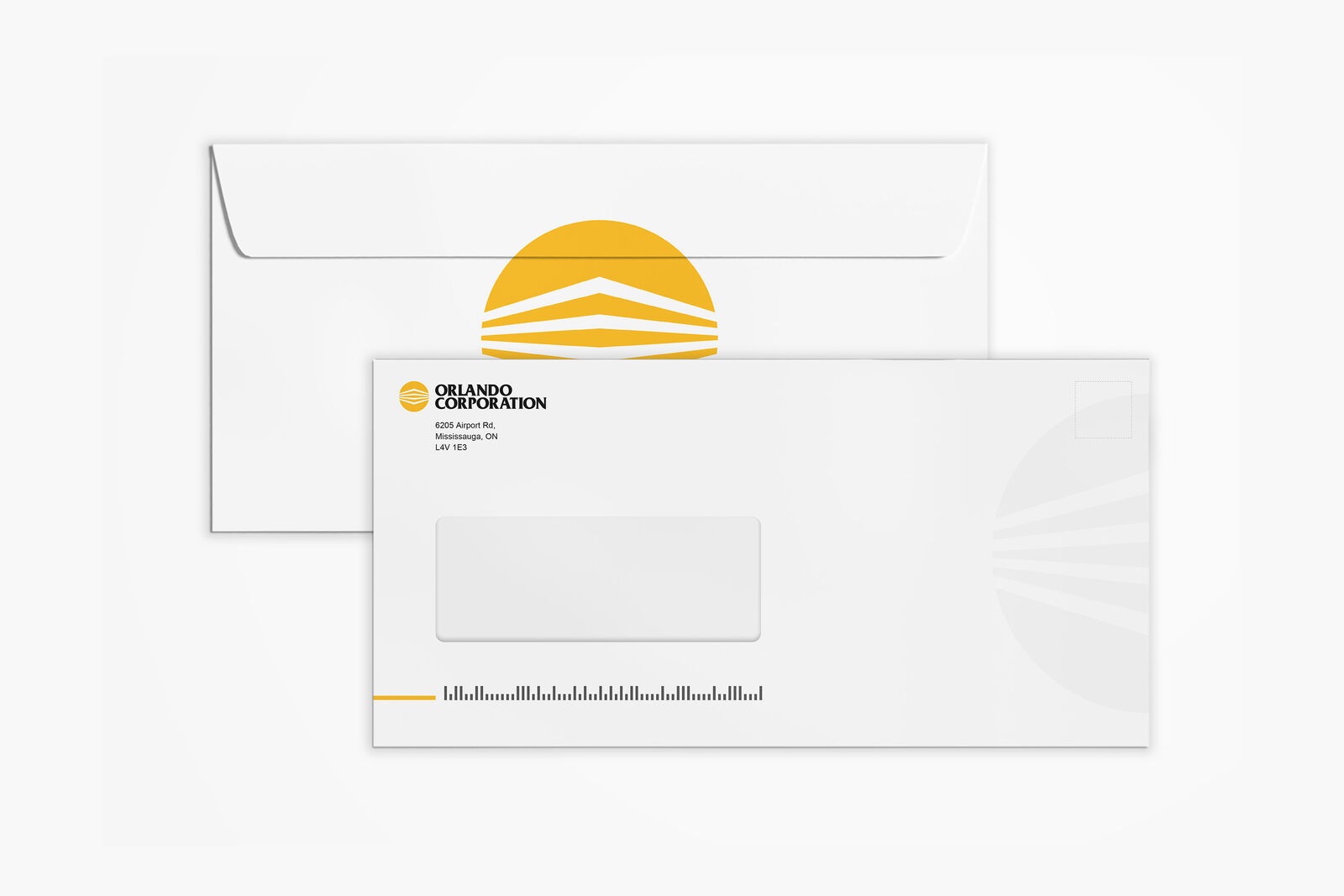
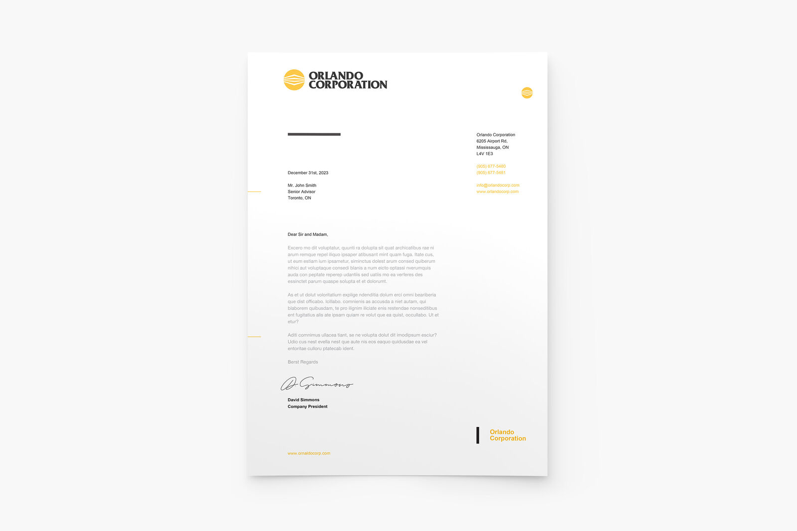
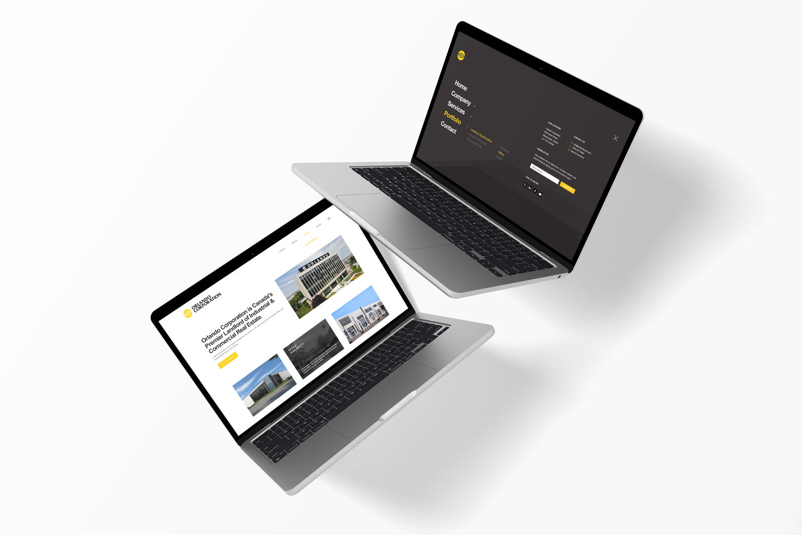
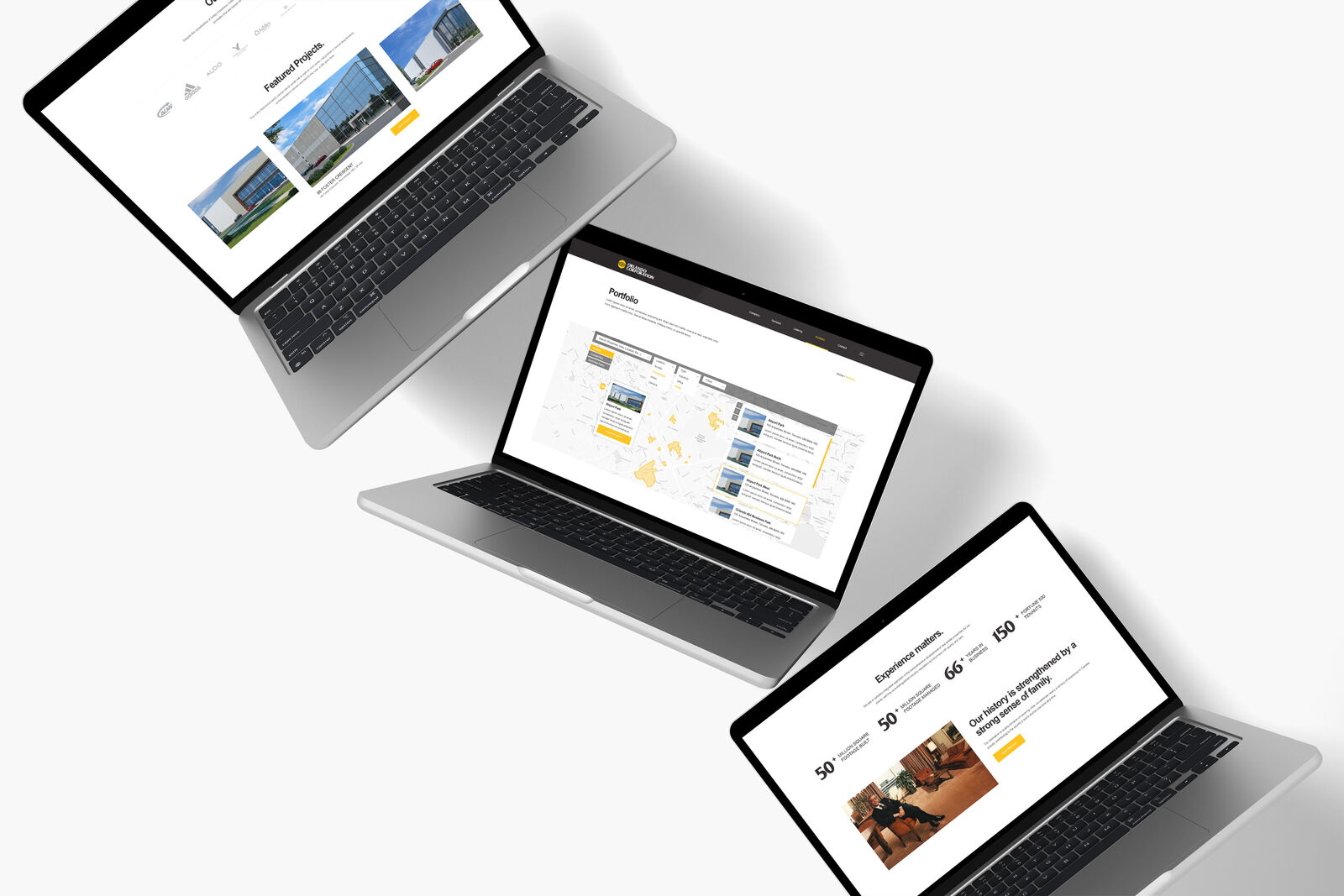
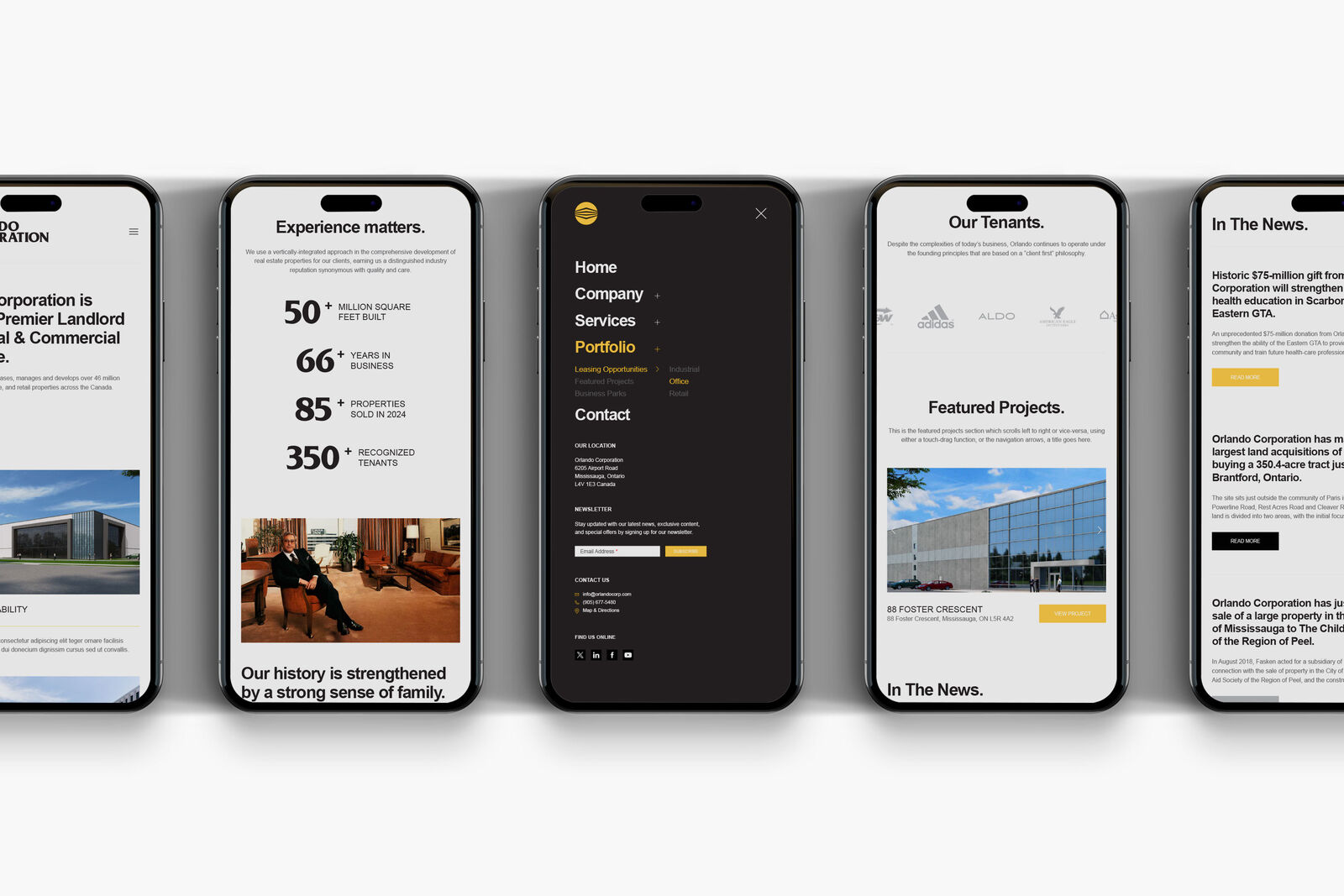
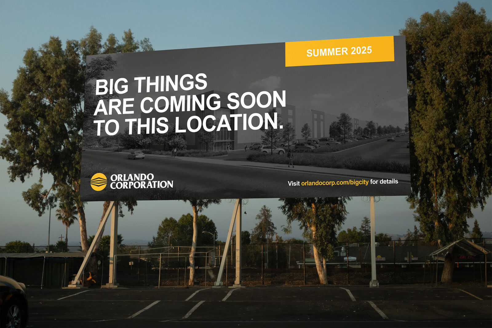
The work covered the full identity suite – logo refresh, a 14-page brand and identity guide, stationery (cards, envelopes, letterhead), OOH placements, and a redesigned website across desktop and mobile. The guide was the backbone of it, giving the organization a repeatable framework so the brand stayed cohesive across teams, properties, and touchpoints without needing a creative director in the room every time.
* Some of these designs are client concepts only, and may or may not have been included in final production.